Expo West 2023 Rebrand Gallery: Harmony, Four Sigmatic and Eclipse Unveil Fresh New Looks
Though Expo West is a popular launch platform for new products, the show also serves as a viewing ground for companies’ rebrands and packaging refreshes existing products and formats. Check out this gallery to see the new looks from brands including Eclipse Foods, Maria & Ricardo’s and Four Sigmatic, among others.
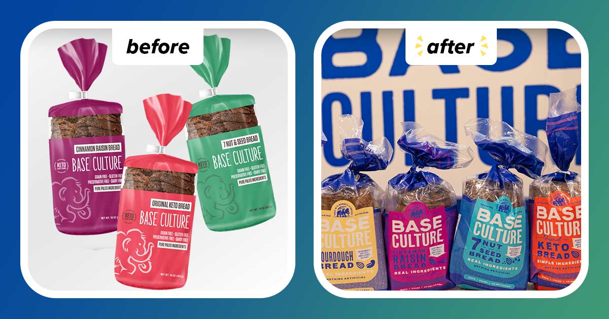
Base Culture
Grain-free, gluten-free baked goods producer Base Culture, is reinvigorating the packaging for its core line of bread, trading in its former monochromatic packaging for brighter background colors and a bold font choice. The product names have been made larger for easier readability and clearer product differentiation. Additionally, the brand’s woolly mammoth mascot, a nod to Base Culture’s “Paleolithic roots,” has been significantly reduced in size and relocated to the top of the bag.
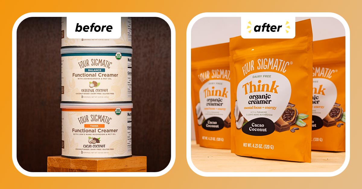
Four Sigmatic
Four Sigmatic showcased a complete redesign of its packaging, both in looks and, in some cases, packaging forms. For example, its Cacao Coconut Organic Creamer has been switched over from a 4.23 oz. container to a pouch. The entire line now sports a brighter color palette, with names, like “Think” more prominently featured in order to quickly convey functional benefits.
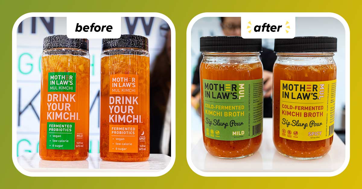
Mother In Law’s
Brooklyn-based Mother In Law’s unveiled a new look for its drinkable kimchi, which launched at Expo West 2022. The kimchis are now packaged in glass jars with labels for the Mild and Spicy varieties color-coded to better differentiate them. Additionally, the product description of “cold fermented kimchi broth” and the callout to “sip, slurp, pour” have been added.
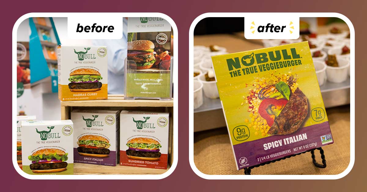
No Bull
Veggie burger brand No Bull traded out its plain white background for a more eye-catching olive-green color that ties in with the brand’s forest green logo and large tagline, “The True Veggieburger.” The brand axed the clear film that showcased the product inside, instead opting to use photography of the product and its ingredients.
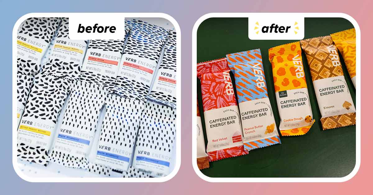
Verb Energy
Caffeinated energy bar maker Verb has swapped out its predominantly black-and-white packaging for bright, bold colors. Each individual flavor – Chocolate Peanut Butter Cup, Red Velvet, Peanut Butter Crunch, Cookie Dough, S’mores and Chocolate Chip Banana Bread – is now clearly delineated via a specific pattern as well as an illustration, the latter also serving to offer flavor cues.
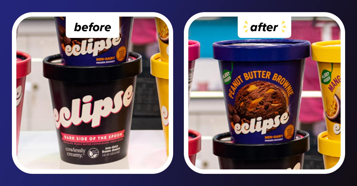
Eclipse
On the heels of its launch in Harris Teeter stores, Oakland, California-based Eclipse has added product photography to its pints of plant-based ice cream. Available in six core flavors – Cookie Butter, Dark Side of the Spoon, Mint Chip, Caramel Butter Pecan, Vintage Vanilla and Mango Passion Fruit – each carton features an image of a scoop of ice cream alongside a photo of the ingredients used.
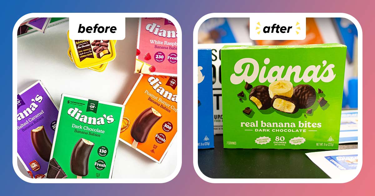
Diana’s
Frozen treat producer Diana’s showcased a new look for its line of chocolate-dipped bananas. The revamped packaging features a new retro-inspired script logo as well as product photography.
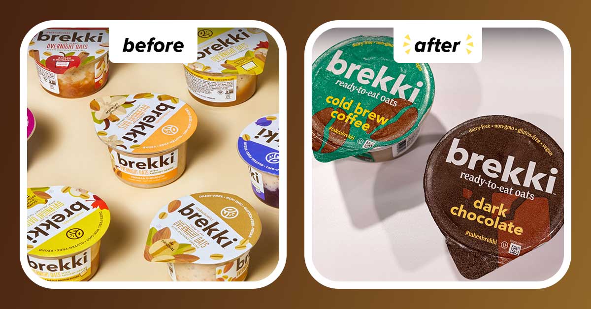
Brekki
Nearly three years after being acquired by Cedar’s Foods, ready-to-eat overnight oats brand Brekki unveiled an eye-catching look. Though its clear plastic containers still allow consumers a peek at the product inside, the new labels feature more intense colors such as chocolate brown and emerald green and a graphic design Additionally, the peel-away foil lid now features a QR code to learn more about the brand and its other products.
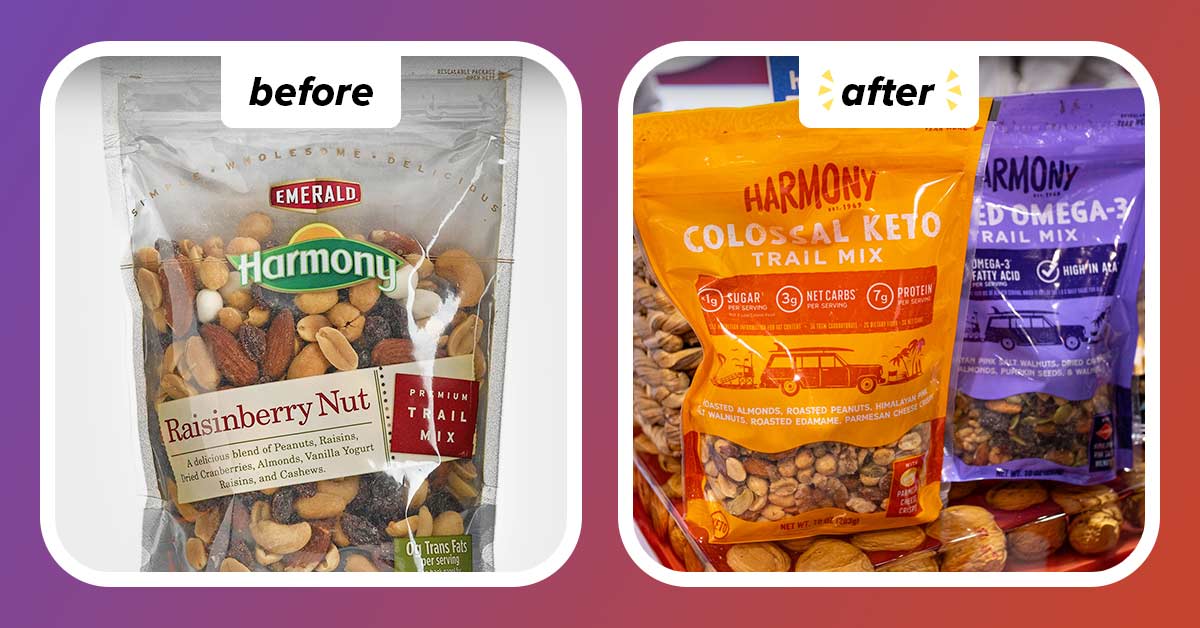
Harmony
Diamond Foods’ dried fruit and nut trail mix brand, Harmony, unveiled a dramatic new look that pays homage to its California roots with a beach scene complete with a surfboard strapped to a station wagon, a lifeguard stand and palm trees. Additionally, the trail mixes feature sizeable callouts highlighting health-forward attributes such as “7g of protein per serving” and “high in ALA.”
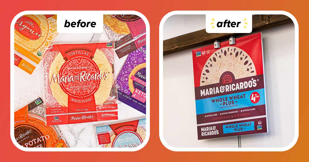
Canton, Massachusetts-based Maria & Ricardo’s unveiled a brighter, bolder new look across its portfolio of original, organic, gluten-free and almond keto tortilla wraps.