Packaging Updates: Chao, Unbun, Verve and More Rethinking Front-of-Pack Callouts
Trade shows have long been a launching ground for brands to show off new packaging and branding. At this year’s Natural Products Expo West, food makers arrived armed with new looks to help their products continue to pop on-shelf as consumer shopping habits shift between in-store and online. Here are some notable packaging redesigns we saw on the show floor.
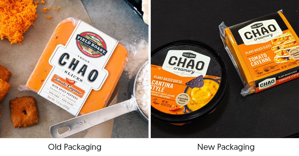
Chao Creamery
Plant-based dairy brand Chao embraced a stronger color scheme with its newest packaging design, swapping out its minimalist light-colored wrapper for high-contrast, bright tones. The company has also added food photography to its front label to highlight the versatility of its soy and starch-based cheeses. Additionally, the new design places the Chao logo in the center, with the logo of Field Roast, the line’s parent company, made less prominent.
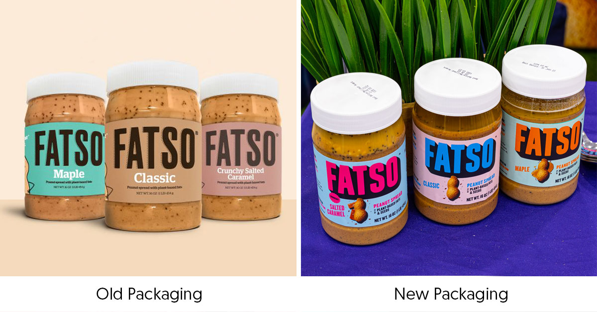
Fatso
Nut butter maker Fatso has brightened up its packaging, ditching its simple brown logo across a pastel background in favor of contrasting dark and neon tones. The company also added pictures of peanuts and spreads on the front-of-pack accompanied by neon-colored flavor callouts. The new design offers increased shelf appeal compared to its previous look that embraced muted colors, smaller text for ingredient callouts.
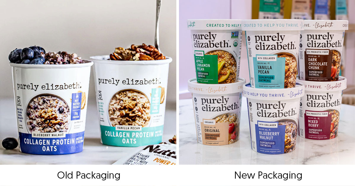
Purely Elizabeth
Breakfast staple maker Purely Elizabeth’s revamped its packaging design to feature a bolder logo and more clear flavor callouts. The new packaging, which was alluded to in the brand’s announcement of a $50 million raise, now places the product line and functional attributes in a less prominent spot in addition to moving product imagery and nutritional callouts to the periphery.
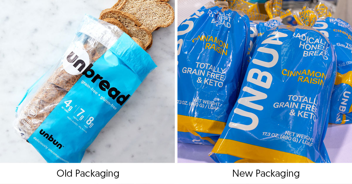
Unbun
Low carb bread maker Unbun unveiled an entirely new look that clearly states its brand and keto positioning. The new packaging also removed all front-of-pack nutritional information, instead simply featuring the flavor and a “Totally Grain-Free & Keto” callout. Unbun is also embracing a greater contrast within its color scheme with the addition of a gold-yellow tone in place of black text against its sky blue bag as well as bringing each loaf into a solid-colored bag, removing a window to see the product.
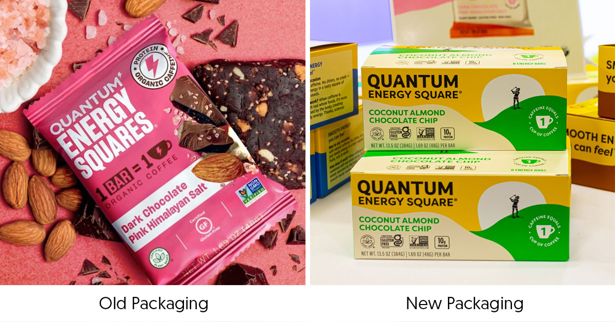
Quantum Energy Squares
Energy bar brand Quantum Energy Squares is taking on a more natural look by swapping its bright, solid-colored packs for lighter, earthy tones and illustrations of various outdoor activities on front of pack. The new packaging still features a callout for caffeine in each bar but has decreased the emphasis on its Non-GMO Project Verified, gluten-free and plant-based certifications to simple callouts.
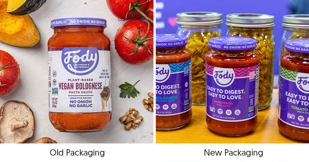
Fody
Allergy-friendly food maker Fody is ramping up the vibrancy of its packaging, adding a swath of purple and a band of neon waves designed to attract the shopper’s eye. The brand has also added clearer flavor callouts and a new tagline, “Easy to Digest. Easy To Love.”
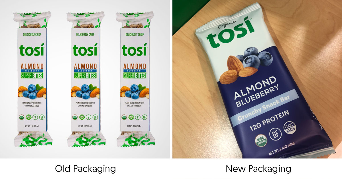
Tosi
Better-for-you snack maker Tosi is taking on a bolder, cleaner look with its new packaging design by bringing flavor names to the forefront, as well as adding ingredient photography and a coordinated pop of color. The brand has also renamed its SuperBites line to Crunchy Snack Bar but retained its plant-based, gluten-free and organic callouts on front of pack. The changes are designed to help the brand better stand out in both traditional grocery retail as well as food service, where it has a significant presence.
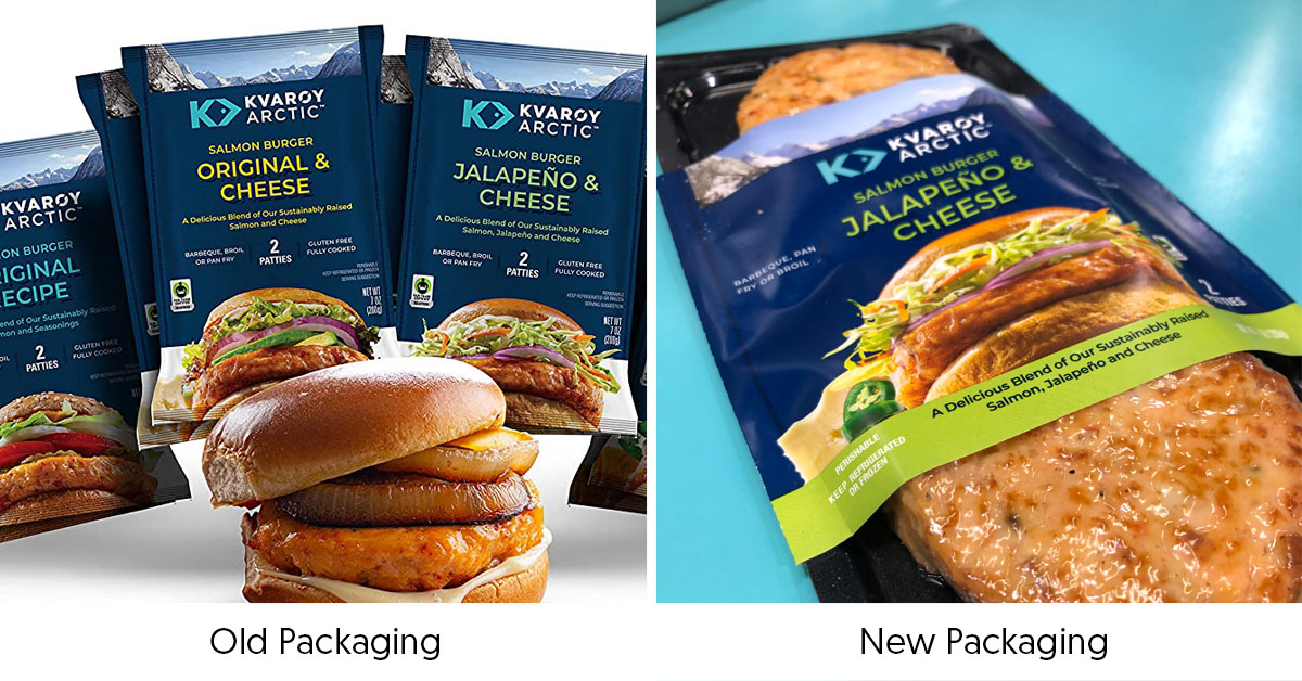
Kvaroy Arctic
Kvaroy Arctic is amplifying transparency on pack for its sustainably-sourced, frozen salmon burgers. The seafood company has moved the four-SKU line to the same tray and clear plastic package used for its Salmon Hot Dog line which gives consumers a look at the actual product as they scan the frozen set. The company said it will help consumers better understand what they are purchasing, key with a newer type of product like a seafood-based burger, and better communicate quality.
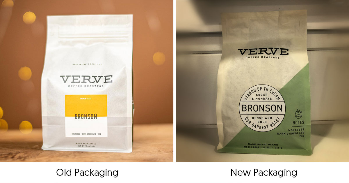
Verve
Coffee company Verve added more personality to its packaging with new phrases on the front of pack that are designed to tell customers how to use each coffee blend, and add a dash of whimsy as well — its Bronson blend, for example, states that it can “stand up to cream, sugar and Mondays.” The company has also increased the font size for its flavor notes as well and added more flavor cues.