Rebrand Roundup: Eight New Looks For On-Shelf Appeal
Packaging that draws consumers to a product on-shelf doesn’t always pop on screen. In today’s world of omni-channel shopping habits, where shoppers are discovering new brands in-store and online, food companies have been challenged to shift to new strategies, rethink old tactics and help their product find a new sweet spot for success. Here are eight food brands launching upgraded looks with everything from refreshed branding to new packages and total design overhauls.
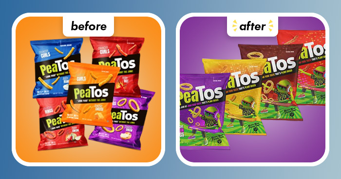
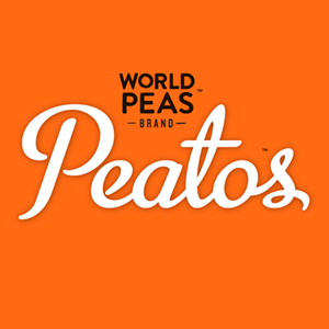
Peatos
Better-for-you “junk food” maker Peatos has transitioned its product portfolio to be entirely plant-based and is aiming to cater to younger consumers with the introduction of revised packaging featuring a new mascot, “sassy female character, DJ_P.” The new packaging features brighter colors and reflects a “unique fun and flavor first” product according to Nick Desai, founder and CEO of PeaTos. This is the second time the salty snack maker has updated its look, with its first refresh coming in 2019 after the company was served with a cease and desist order from PepsiCo Frito Lay’s brand Cheetos, alleging trademark infringement.
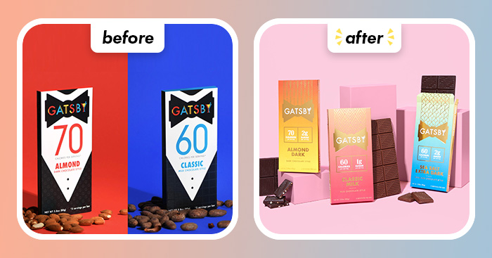
GATSBY
Seeking to embrace the contrast of low-calorie better-for-you indulgence, Gatsby chocolate has introduced a new colorful redesign, with an attempt at a “2020’s take on 1920’s style.” The new packaging, which debuted last month, features warm, bright tones, a shiny, mono-chrome logo and eye-catching flavor designations. Created by Halo Top ice cream co-founder Doug Bouton, Gatsby’s new look contrasts “the formality and stiffness of art deco designs with the vibrancy and energy of bright ombré color patterns,” he said in a press release.
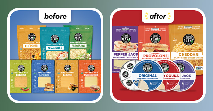
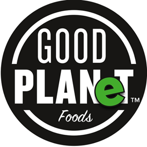
GOOD PLANeT
To show off its melt-ability, plant-based dairy maker GOOD PLANeT introduced a refreshed packaging design that brings food photography front and center on-pack. The dairy-free cheese has also been reformulated with the goal of offering consumers “a smooth cultured flavor that tastes, looks, and melts just like dairy cheese.”
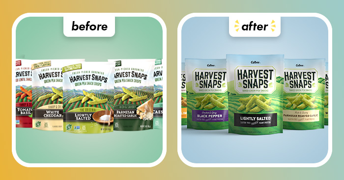
Harvest Snaps
Aiming to boost its shelf-appeal, baked veggie snack brand Harvest Snaps redesigned its packaging with a more prominent, modernized logo and added large images of the crunchy snacks amid scenes of rolling hills and green-blue tones. However, back-of-pack is of equal importance to Harvest Snaps, which now tells the origin story of these better-for-you baked snacks. The new look has already begun rolling out to stores and was driven by category insights that suggest simplified messaging and distinctive brand assets drive snack sales.
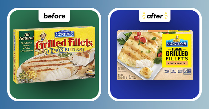
Gorton’s Seafood
With even more yellow and a logo upgrade, Gorton’s Seafood hopes its Smart Solutions and Everyday Gourmet lines will stand out even more among the ocean of products in the frozen food aisle. The company said adding more yellow on-pack makes each product’s name and benefits easier for consumers to quickly identify. The new logo, which incorporates waves behind Gorton’s Fisherman mascot, aims to reflect the brand’s mission of “bringing the goodness of the sea to everyone.”
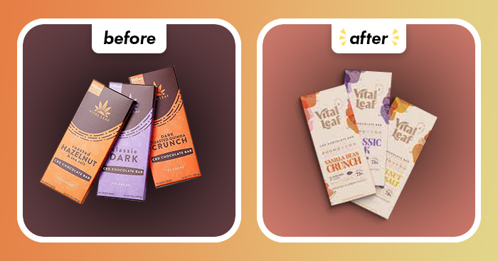
Vital Leaf
CBD nutrition platform Vital Leaf lightened up its look with a new package featuring a neutral background and abstract, metallic elements. Its CBD chocolate bar line is looking to embrace a premium and uplifting look that clearly emphasizes its values including its “purity and potency” and environmental commitments such as its organic, fair trade ingredients and partnership with 1% For The Planet.
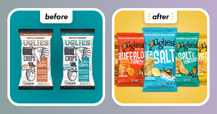
Uglies
Uglies Kettle Chips new look is anything but unattractive. The upcycled potato chip maker introduced its first packaging redesign since its launch in 2017 alongside a new logo and website. The new bags are “Bright, bold and impactful,” and aim to capture the brand’s mission to reduce food waste, support farmers, and fight hunger by using imperfect potatoes. Additionally, the new look brings a revamped form of its potato character, named Ugly. Overall, the new pack aims to be more user-centric whether they shop for Uglies in store or online.
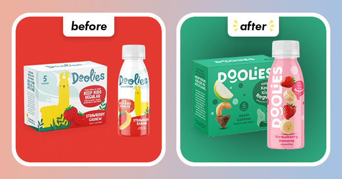
Doolies
Only four months since the brand debuted, General Mill’s kid-focused, constipation-fighting product line Doolies has unveiled a new look with brighter colors and fruit photography. The redesign was introduced ahead of the brand’s recent launch on Amazon and features simplified messaging and warmer tones on-pack.