Expo West Gallery: Mighty Yum, SkinnyDipped and Doughlicious Unveil New Looks
Though Expo West may be primarily known as a launch platform for new products, many brands took to this year’s show to highlight rebrands and packaging refreshes across existing products and formats. Check out this gallery for more information about the fresh new looks from brands including Beyond Good, Solely, SkinnyDipped, Doughlicious and more.
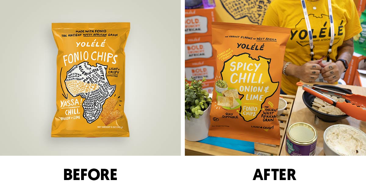
Yolélé
West African food brand Yolélé showed off its new packaging design during the show which now features food and spice photography on the front of its fonio and fonio chip packs. The brand has also elevated the product’s flavor callouts – which range from Tangy Baobab to Yassa Chili – to make the variety the first thing consumers notice on pack. The brand has also simplified its front of pack messaging with explanatory callouts like “Ancient West African Grain.”
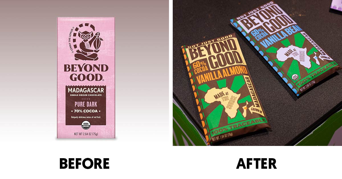
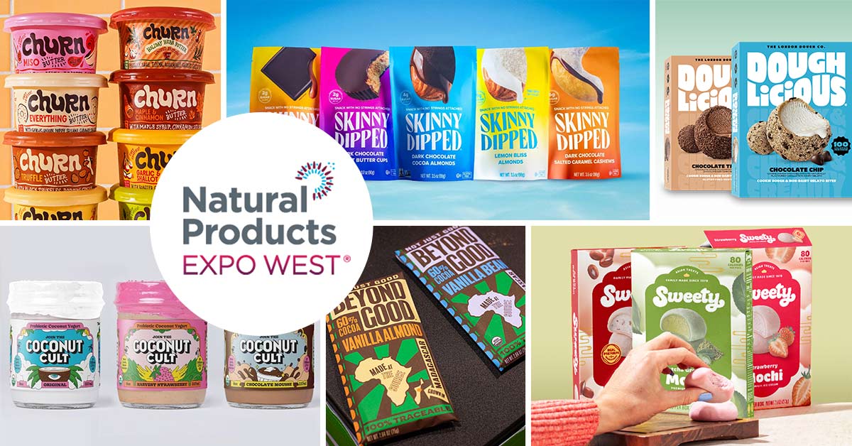
Beyond Good
Madagascar-produced chocolate company Beyond Good unveiled a completely new look that aims to easily tell its sourcing story to consumers with a map of Africa now prominent on the front of its chocolate bars. The new design also calls out how the brand’s responsibly-sourced cocoa sourcing protects native plant and animal species in the country. The new package also reflects a more nature-derived color palette.
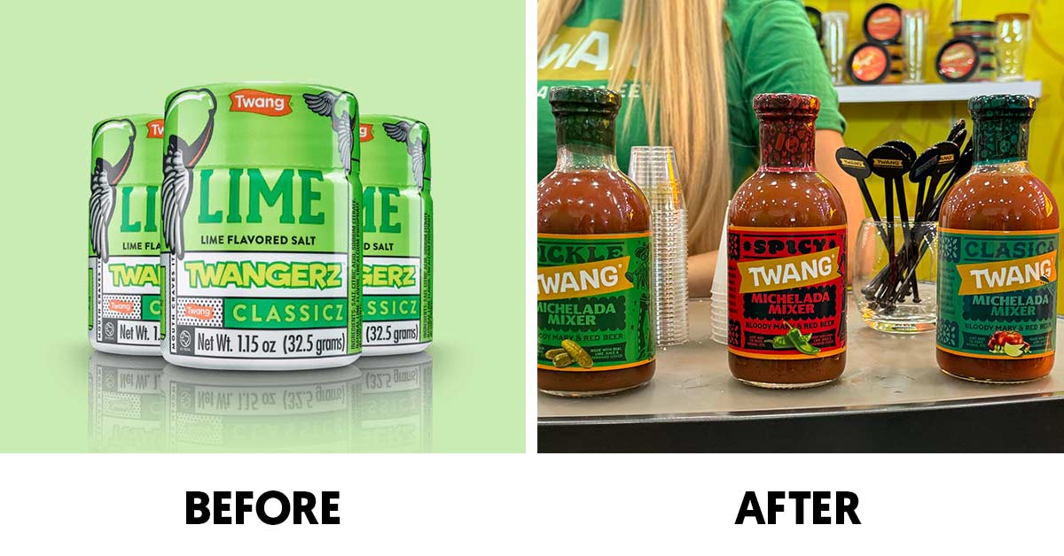
Twang
Beer salt and margarita mix maker Twang has made moves to unify its product lines under a single banner; previously, the salt lines went by Twangerz while its drink mixes and other items were known as Twang. The nearly 40 year old Texas based company has also made its brand name more visible on the front of pack, reducing the product type in the label hierarchy.
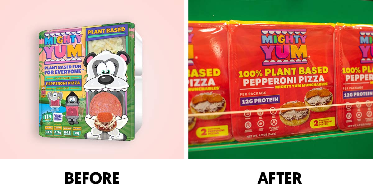
Mighty Yum
Plant-based Lunchable-alternative maker Mighty Yum has simplified its look by adopting flavor-specific solid colors for each front-of-pack design. The new package places its brand name front and center and highlights that it is “100% Plant-Based” alongside the variety callout. The brand also elevated protein and nutrition information while putting a greater focus on food photography as well.
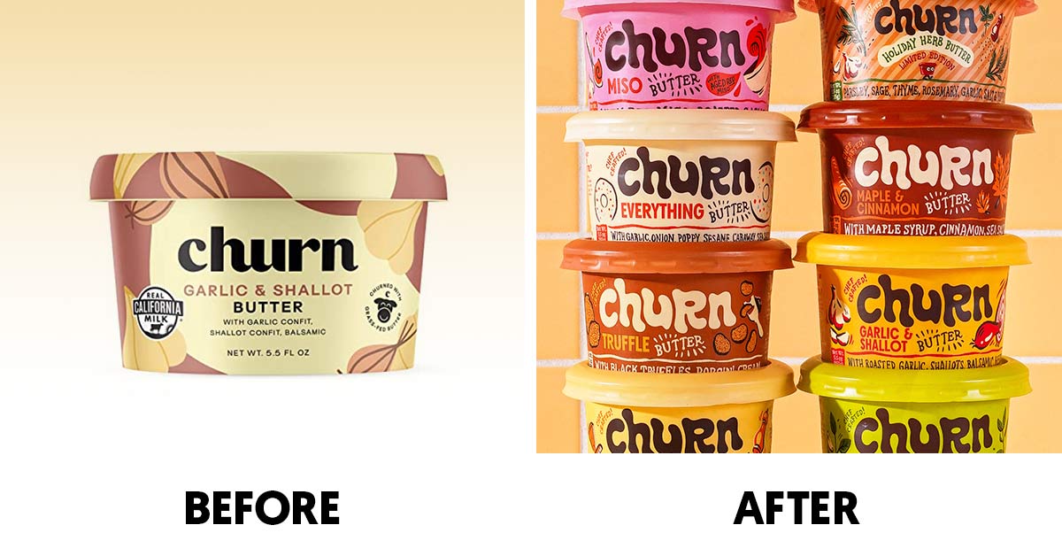
Churn
At the show, California-based Churn unveiled a vibrant, bold new look for its chef-crafted, grass-fed flavored butter. The new packaging features a funky, wavy bolded logo with colorful illustrations of the ingredients inside each variety. Additionally, each individual flavor has its own unique colored tub to better differentiate between flavors – which include Everything, Parmesan & Pepper, Black Garlic, Truffle, Miso, Maple & Cinnamon, Garlic & Shallot, Bruschetta and Pesto.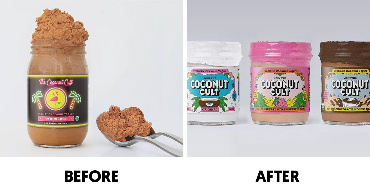
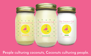
The Coconut Cult
Probiotic yogurt brand The Coconut Cult came to Expo West with a new look replacing the signature pink flamingo mascot on the front with visual representations of each flavor. The glass jars keep with the same homemade appeal but with a new description calling the product a “Super-Live Probiotic Yogurt” as well as a tagline telling potential customers to “Join the Coconut Cult.”
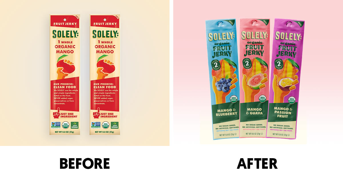
Solely
It’s not just more vibrant colors that were prioritized for dried fruit brand Solely. The snack maker replaced the cartoon representation of each product’s hero fruit with an actual photo image making the star ingredient pop on the packaging. Along with the refreshed visual identity, Solely also added a new tagline: “No Artificial Anything.”
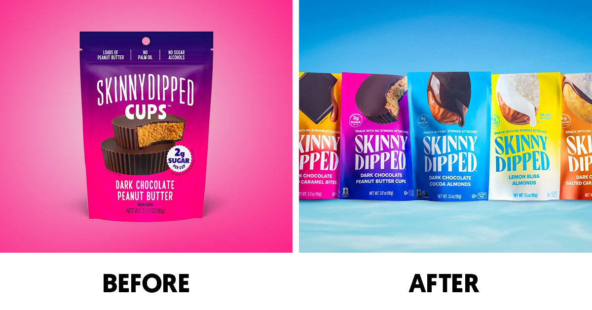
SkinnyDipped
SkinnyDipped, the maker of lower-sugar confections and coated nuts, unveiled a packaging refresh inspired by skinnydipping; the new logo features “subtle water references” to evoke fun and freedom. Additionally, the updated design sports a new tagline, “Snack With No Strings Attached,” and showcases the brand’s Fair Trade, Kosher and Non-GMO Project Verified certifications.
“After nearly a decade of growth, and on the heels of closing our Series A, we decided it was time for a SkinnyDipped glow up,” Breezy Griffith, CEO of SkinnyDipped, said in an emailed statement. “Our logo now features a new signature wavy font, and our packaging maintains our iconic colors while giving them a bit of elevated gloss.”
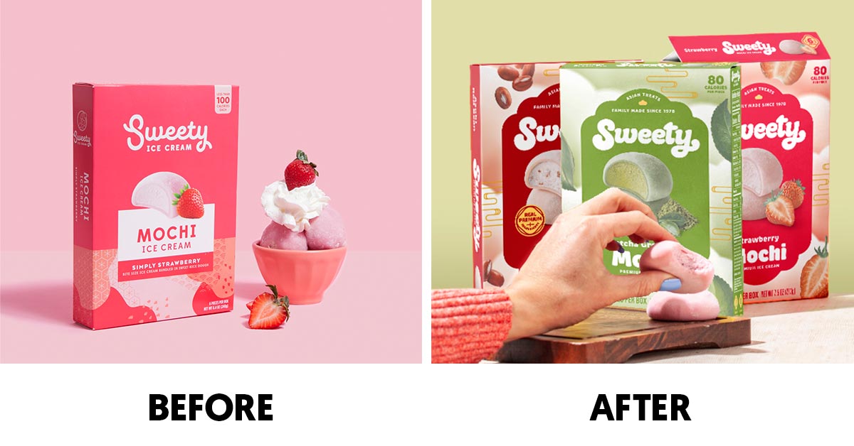
Sweety Ice Cream
Mochi maker Sweety Ice Cream debuted refreshed packaging at Expo West. Tiffany Yang, co-founder and CMO, said the new visual identity adds “a modern edge while still paying homage to our family’s roots and the family history behind Sweety.” Cloudlike typography mirrors the brand’s “soft and bouncy” mochi dough. The design draws inspiration from Wabi Sabi prints and Japanese block stamps, while also incorporating a new mochi mascot named Mo.
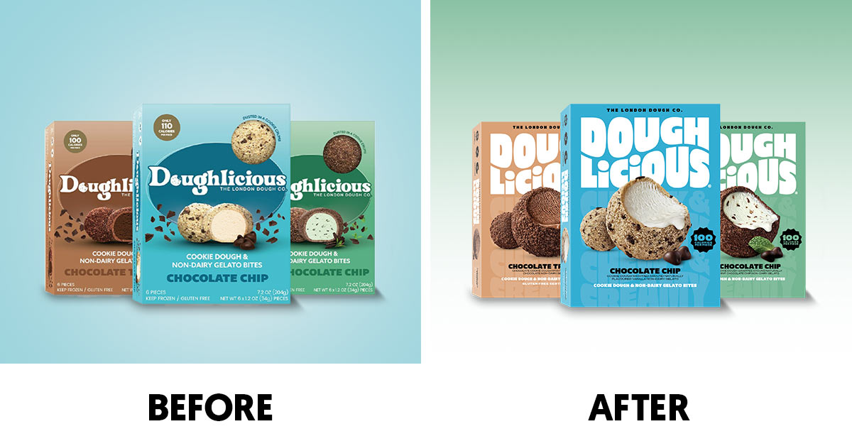
Doughlicious
Shortly after crossing the pond, The London Dough Co.’s snacking platform – Doughlicious – has adopted a new look that “embodies the essence of its products.” In the U.S., this includes a line of dairy and non-dairy Frozen Cookie Dough Gelato Bites. The new packaging spans the brand’s U.S., U.K., and Australia product portfolios to “harmonize” the brand’s offerings.
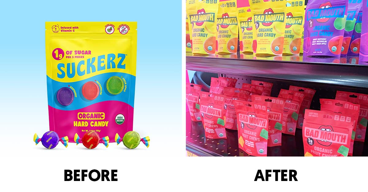
Bad Mouth
Low-sugar candy maker Suckerz has gotten “Bigger and Badder” with its new look and brand new name: Bad Mouth. According to a spokesperson for the brand, the new, more mature identity appeals to a broader demographic and opens up opportunities beyond hard candy – starting with the brand’s new Organic Fruit Chews.
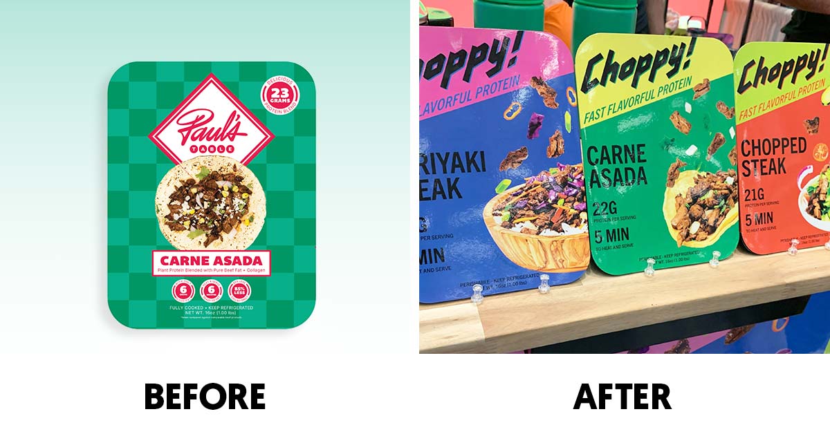
Choppy!
Formerly Paul’s Table, Choppy! offers a line of heat-and-eat meat alternatives made with plant protein, beef tallow, bone broth and collagen.