Plum Organics Rebrand Highlights Transparency

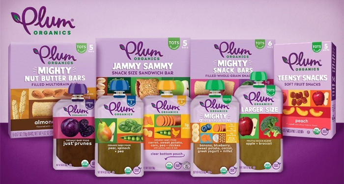
Organic kids food maker Plum Organics has fully redesigned its packaging across its entire portfolio that graphically represents the different products’ offerings.
Sun-Maid Growers of California, the parent company of Plum Organics, announced the revamped look on Tuesday highlighting how the new packaging gives parents a better understanding of the ingredient and flavor profile of each product.
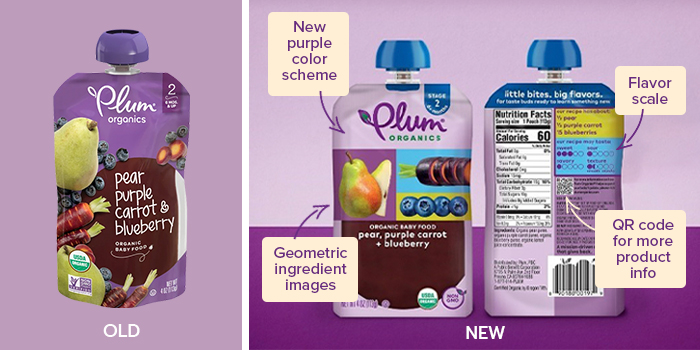
Although the primary label has not changed, the new plum-purple colored packaging reflects the various products’ ingredients through images in boxes. The previous branding differentiated flavors by color scheme and showed the various fruits and vegetables scattered across the front label.
“Parents everywhere want their kids to form healthy, balanced relationships with food, including the experience of trying new things and expanding their taste palates from an early age,” said Harry Overly, Executive Chairman of Sun-Maid Growers of California. “We want parents to feel confident that the food they feed their kids will grow their mind and body, which is why Plum prides itself on creating nutrient-dense foods in a variety of flavors, colors and textures that inspire young children’s curiosity to expand their world.”
The rebrand is also intended to bring more clarity to consumers by offering a “flavor scale” on the back of the brand’s packaging, which categorizes Plum’s products by taste (sweet, sour or savory) and texture.
The new package design also includes a QR code that directs consumers to the company’s website “emphasizing the importance of teaching children to love new foods through repeated exposure to a variety of fruits and veggies,” according to the company press release.