Rebrand Roundup: Brands Seek Sleeker Storytelling
With limited time to connect with consumers on shelf, brands need to stand out visually and tell their stories in just a matter of seconds. These recent rebrands, several of which debuted at the Winter Fancy Food Show this week, show how companies are looking to sleek, eye-catching designs to not only pop on shelf — but keep consumers hungry for more.
View the slideshow above for a look at some recent rebrands and then read on for insight into the changes.
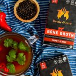
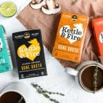
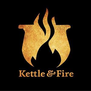
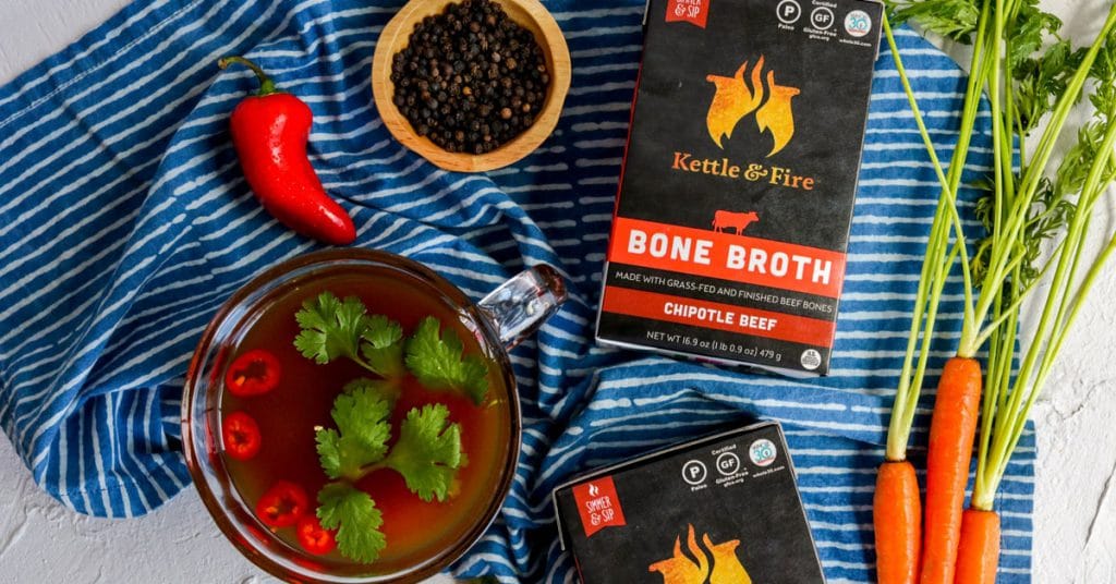
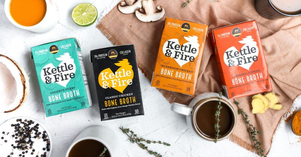
Kettle and Fire: A Bolder Approach
A lot has changed since Kettle and Fire launched their current packaging in 2016 — namely growing from two broth offerings to 16 SKUs, including both broth and soups. The rebrand, which will launch on shelves in March, moves the brand to a more cohesive design that works across all products. Founder Justin Mares told NOSH that the previous packaging didn’t touch enough upon quality, or explain more “complex” stories such as the use of adaptogens in some products.
“We decided to modernize, streamline and unify our look and feel on-shelf with this rebrand,” Mares said. “We wanted the brand to take its next step and evolve in a more modern direction that a larger swath of consumers can connect with.”
The redesign, Mares said, should help further support the company’s growth. Kettle and Fire has already doubled its distribution and increased revenue over 100% since venture capital firm CAVU Venture Partners invested $8 million in 2018.
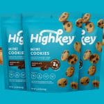
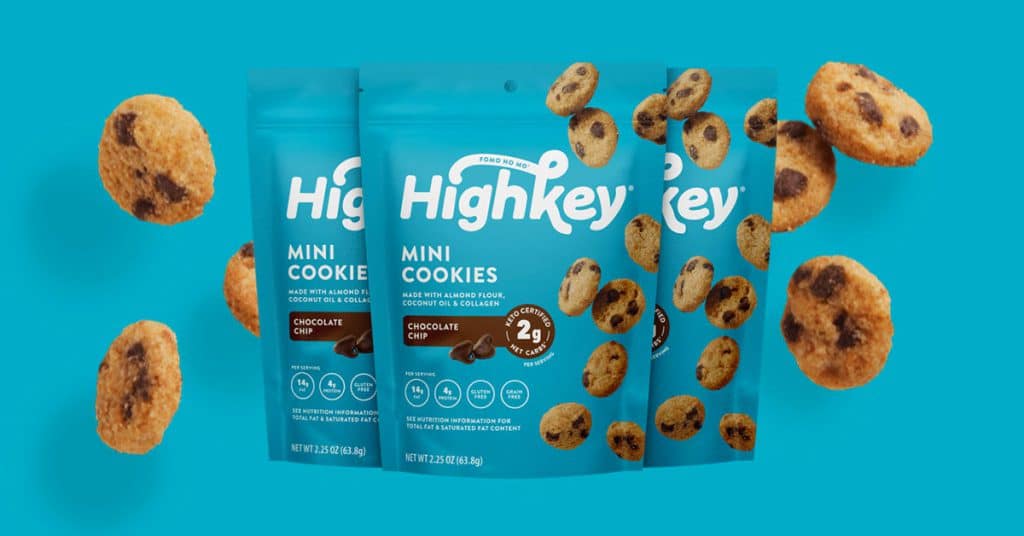
HighKey: Fresh Look and Keto-Friendly Pancakes
Best known for its Chocolate Chip Mini Cookies, at the Winter Fancy Food Show, low-carb sweets brand HighKey highlighted its new logo, redesigned packaging and new tagline — “FOMO NO MO’” — all inspired by the brand’s drive to create low-carb snacks that taste like the original versions.
The updated packaging, which was announced last month, features more colorful, bright branding and callouts about key ingredients and net carbs in order to support the brand’s better-for-you claims, while still maintaining a “high energy” and “playful design.” Packaging will be particularly important for the brand as it looks to expand beyond its current Amazon business and into retail this year — competing on shelf against larger, more established brands.
“We are foodies who crave good stuff and aim to deliver on products that empower better eaters and keto dieters to polish off a whole bag of treats without the guilt,” co-founder John Gibb said in a release. “Our new look and messaging reflect the amazing folks we reach every day.”
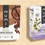
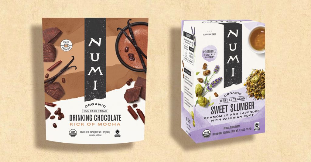
Numi Tea Refreshes Brand
As part of its “commitment to customers and the planet,” at the Winter Fancy Food Show prganic tea brand Numi launched redesigned, more eco-friendly packaging along with two new functional products.
The brand, a certified B-corp, wanted its branding to highlight the ingredients used within as well as develop packaging that was more environmentally friendly. The new packets for its fair-trade organic teas were developed through a partnership with OSC2 Packaging Collaborative, which was also co-founded by Numi CEO Ahmed Rahim, and now use a plant-based film that uses less carbon than traditional plastic, according to the company.
Along with new materials, the packs, also now feature updated imaging and fonts.
“We still use 90% post-consumer waste paper cartons, soy-based inks, and biodegradable Manila hemp tea bags, as we’ve done for the past 20 years,” Reem Hassani, Numi co-Founder and chief brand officer, said in a release. “[But] equally important is the new brand refresh, featuring package imagery and typography that engage our consumers in a way that’s relevant, inclusive and hopeful.”
Additionally, the California-based company debuted Sweet Slumber tea (a blend of lavender, chamomile and valerian root) and a new line of low-sugar, gluten-free Drinking Chocolates in Touch of Chili, Dash of Salt, Kick of Mocha, and Shroom Power with chaga mushroom powder. Sweet Slumber will launch next month in retail with an MSRP of $6.99, and the Drinking Chocolates will launch in July with an MSRP of $9.99.
“People are looking for a delicious, decadent treat that doesn’t compromise their health and instead might actually enhance it,” Rahim noted. “This is part of the reason that cocoa and drinking chocolate are quickly emerging as a major trend in the U.S., approaching $1 billion in revenue in 2019.”
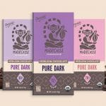
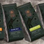
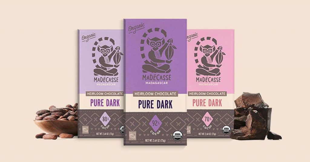
Madécasse Looks Beyond Good
The Fancy Food Show was also the debut for chocolate brand Beyond Good — the new brand of chocolate company Madécasse. Started by two former Peace Corps volunteers who served in Madagascar, Beyond Good will better reflect the company’s mission of working with suppliers accross all of East Africa.
Design agency River + Wolf helped develop the new name after the brand found Madécasse (French for Madagascar) was difficult to pronounce and didn’t fully reflect the company’s current ethos and geographic reach. Moving forward, the company thinks Beyond Good defines both its products’ distinct flavor profiles as well as the brand’s “mission to change the way the world experiences chocolate,” Perry Abbenante, Beyond Good’s VP of marketing, said in a release.
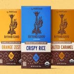
Also at the show, the brand launched three bars under the new moniker: Crispy Rice, Orange Zest and Salted Caramel, all made with chocolate from Uganda. The products will debut in the second quarter, along with a single-serve version of the brand’s Sea Salt & Nibs bar.
“As consumer tastes for dark chocolate evolve, we’re excited to expand our chocolate set with the deep flavor profile of Uganda cocoa and these popular inclusions,” Tim McCollum, founder and CEO of Beyond Good, said in a release. “After pioneering a fully transparent and equitable farm to factory supply chain in Madagascar, we recognize and anticipate the need to scale cocoa operations in East Africa.”
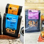
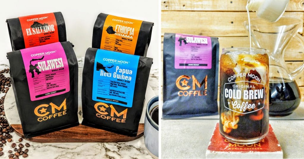
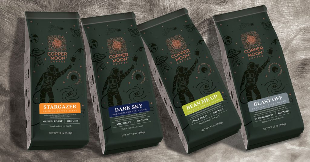
Copper Moon Coffee Launches into Next Galaxy
Indiana-based coffee brand Copper Moon wanted a new, fun look to fuel forward into the next galaxy.
Located near Purdue University, which is known as the “Cradle of Astronauts” due to the 15 astronauts the brand has produced over the years, and started by two Perdue alumni, the company took inspiration from last year’s 50th anniversary of the Apollo 11 moon landing and NASA’s recent commitment to send a mission back to the moon by 2024.
“Our packaging is our most valuable asset at Copper Moon. It is the most prominent way that we can display who we are and what we stand for to our customers,” Brad Gutwein, Copper Moon Coffee’s CEO, said. “We didn’t just want to take a small step as a company, we wanted to make a giant leap.”
The new look, which replaces packaging first launched in 2014, was designed in collaboration with Faceplant Creative Agency and uses the theme of space to describe the brand’s “Out of This World” coffee. A new copper foil logo stands out against a dark matte and gloss backdrop, with graphics of an astronaut reaching for a cup of coffee and other space-related images and text such as “Handcrafted on Earth” and “Follow us Earthling.” The packaging also highlights Copper Moon Coffee’s new sustainability program — SEE Copper Moon Rising — and is both resealable and lacks a bottom seam to help it sit upright on shelves.
The company debuted the new packaging this week at the Fancy Food Show, launched a new website to support the rebrand and released four new “Out of this World ” blended coffees: Bean Me Up, Blast Off, Dark Sky and Stargazer.
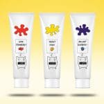
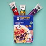
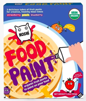
Noshi Reimagines Food Paint Packages
In order to better meet the needs of a key retail partner, organic fruit puree brand Noshi has revamped the packaging for its “food paints,” which come in blueberry, strawberry and peach flavors. The old pack was “just a bit too clever,” CEO Tomo Delaney told NOSH, using a white box with a see-through window to view the white paint tubes with the Noshi character. Ahead of the brand’s launch in Walmart in October, the retailer asked Noshi to revisit its pack design to better communicate the product’s purpose. Walmart, Delaney said, was concerned that the old pack looked more like paint than food.
The new pack, designed by Kirsty Barton, is bright blue and features more prominent fruit characters (along with Noshi) on each tube.
“Food paint isn’t a big idea; it’s just a healthy, organic condiment that kids can use in place of maple syrup or strawberry sauce, in tubes small enough for them to handle,” Delaney said.


