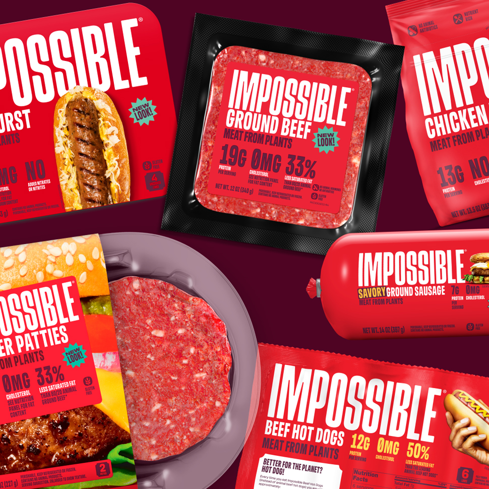
If you’re going to promise a plant-based meat experience that tastes as good as the animal like Impossible Foods does, you’ll need a packaging design that matches. Consider that box ticked: In March, the 13-year-old brand unveiled a meatier, bright red aesthetic appealing to the “carnivorous cravings” of meat eaters amidst retail sales declines in the alt-meat category.
The new butchershop-inspired Sans Meat typeface, splashed against a blood-red backdrop, stands out in the category’s sea of green, while the nutrition callouts audaciously challenge the preconceived notion of what defines “meat.”