
2019 EXPO WEST COVERAGE IS SPONSORED BY |
||||||
|


Expo West Gallery: Familiar Brands Adopt New Looks & Packaging
With only seconds to capture consumers’ eyes on shelf, a product’s packaging is vitally important. And even the most seasoned brand can sometimes need to revise packaging to attract new shoppers.
At this year’s Natural Products Expo West brands rolled out new packaging, logos and branding that emphasized product attributes such as better ingredients, taste and heritage. Here are a few of the new looks that the NOSH team spotted on the floor.
Second Line
Inspired by his home of New Orleans, Supereats founder Aaron Gailmor chose to rebrand the snack company under the name Second Line. The new brand is a nod to the traditional brass band-led neighborhood parades that are ingrained in the city’s culture and incorporates dark blue tones not commonly seen in the snack aisle.
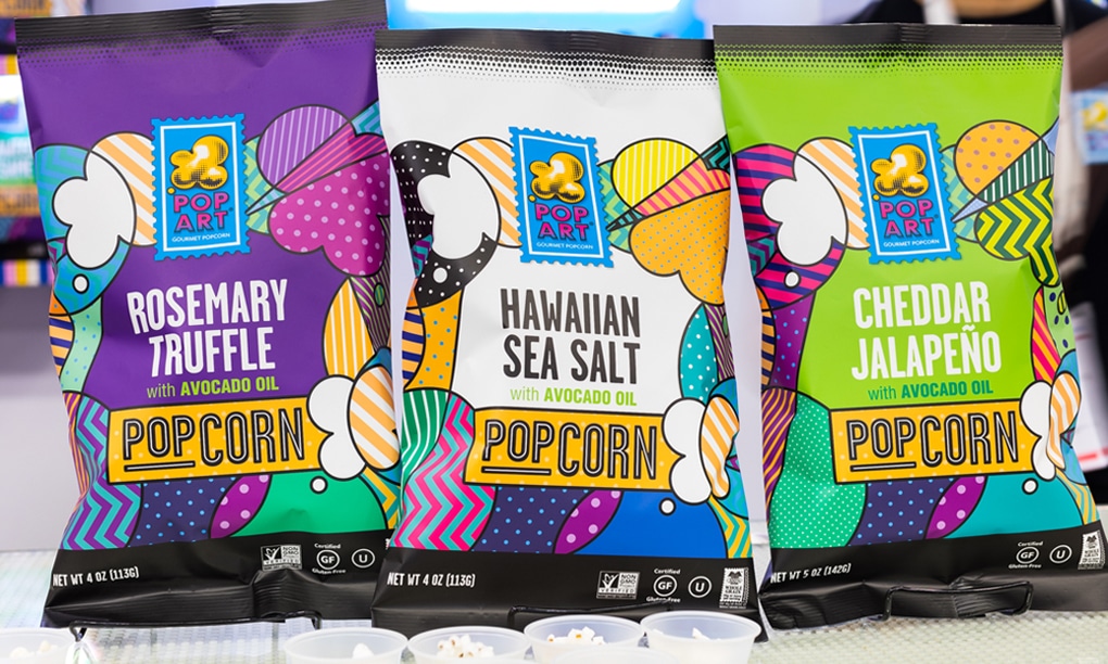
Pop Art Snacks
Inspired by pop art’s ability to transform everyday objects in art, PopArt’s rebrand is inspired by one of the movement’s leading figures, Roy Lichtenstein, for bolder visual aesthetic.
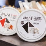
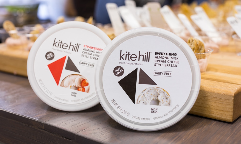
Kite Hill
Plant-based dairy brand Kite Hill’s new packaging de-emphasizes its ingredients -- namely almonds -- in favor of a more whimsical look. The brand’s new geometric “kite” also creates a recognizable graphic that the brand can own in the dairy set.
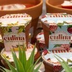
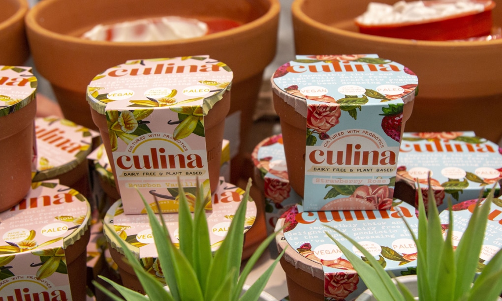
Culina
While the paper packaging on this plant-based yogurt remains, Culina has switched from plastic to using reusable terra-cotta clay pot containers.
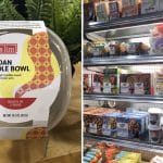
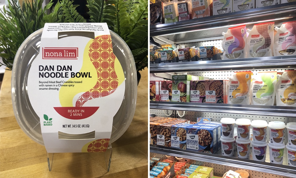
Nona Lim
As Asian-inspired food brand Nona Lim has grown, its portfolio has evolved as well. The company debuted new packaging that speaks to founder Nona Lim’s Singaporean heritage. “Our new packaging and product additions embody the flavors, creativity, and vitality found in these colorful, fresh foods,” Lim said.
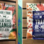
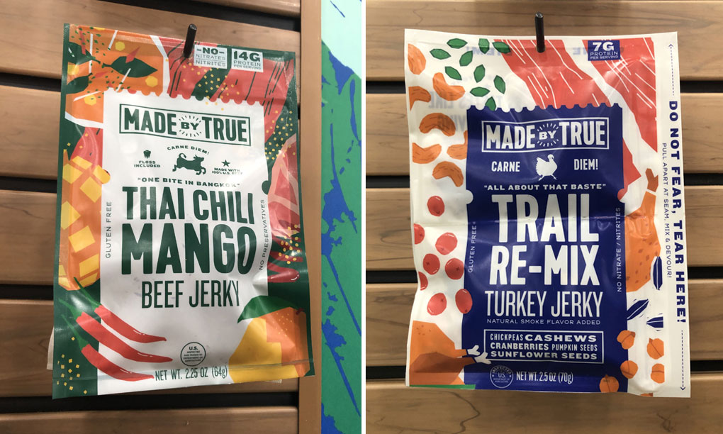
Made By True
Meat snack brand Made by True introduced a new line of biltong last year and now the company is updating the packaging for its jerky line. The new bags now clearly convey the brand’s commitment to bold flavors through the use of vivid colors and eye-catching patterns.
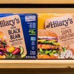
Hilary's
In addition to launching cauliflower and fiesta black bean veggie burgers at the show, plant-based brand Hilary’s also showed off its new “flavor-focused branding.” Hilary’s VP of marketing Becky Harpstrite said the new look emphasizes culinary flavors and should make the brand’s free-from and plant-based attributes more clear to consumers.
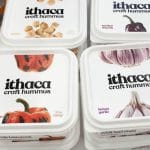
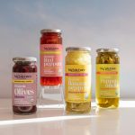
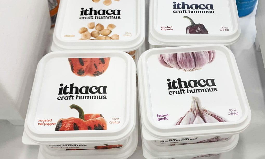
Ithaca Craft Hummus
Ithaca Cold Crafted is now changing its name to Ithaca Craft Hummus. The product signature square packaging will have a new look that emphasizes emphasizes flavor cues over a message of “freshness.”
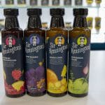
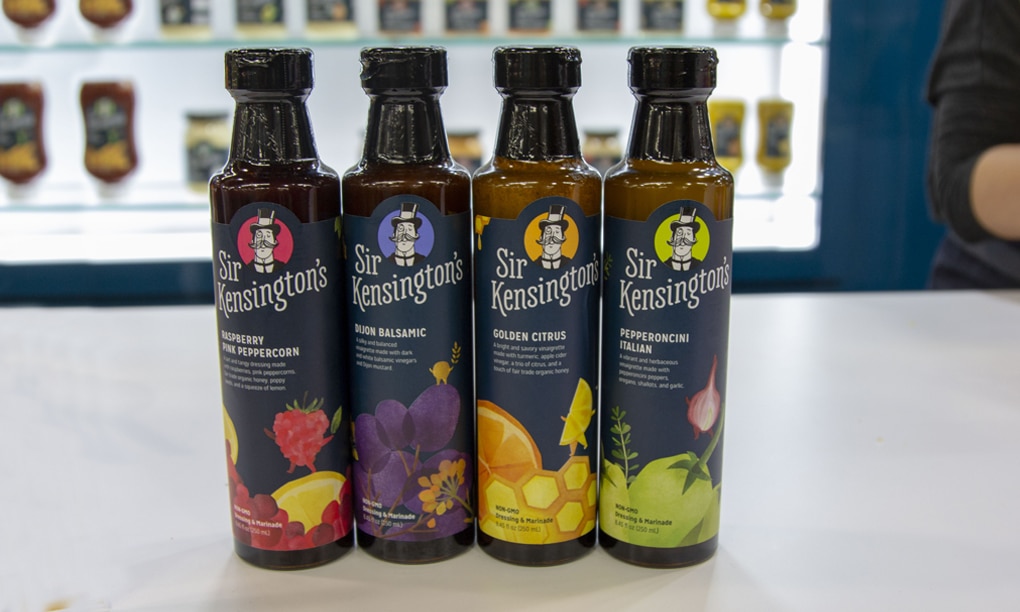
Sir Kensington's
Using the new slogan of “abandon all bland,” condiment company Sir Kensington’s rebranded its line of dips, sauces and spreads to improve shelf presence, increase wordmark legibility, and strengthen the packing communication hierarchy. The packaging change was timed to coincide with the launch of the brand’s new line of vinaigrettes.
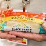
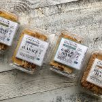
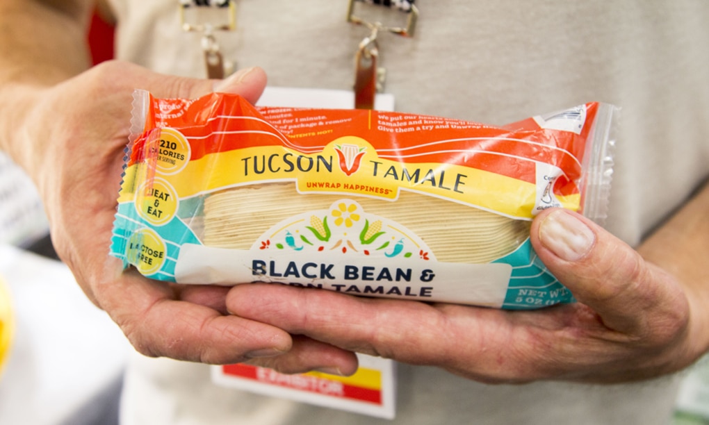
Tucson Tamale
Founded over a decade ago, Tuscan Tamale’s has had fairly utilitarian branding in the past. As the company ramps up its packaged line with more SKUs, owners Todd and Sherry Martin decided to include more artistic details in the packaging that are inspired by their hometown of Arizona.
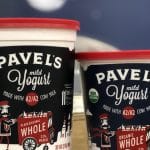
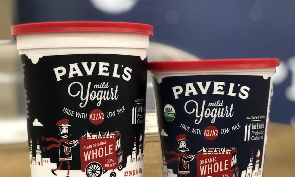
Pavel
Family owned and operated since 1978, Pavel’s Yogurt launched a colorful rebrand that emphasizes the brands’ new use of A2 milk and its mild flavor, replacing its prior callout as “Russian style yogurt.”
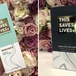
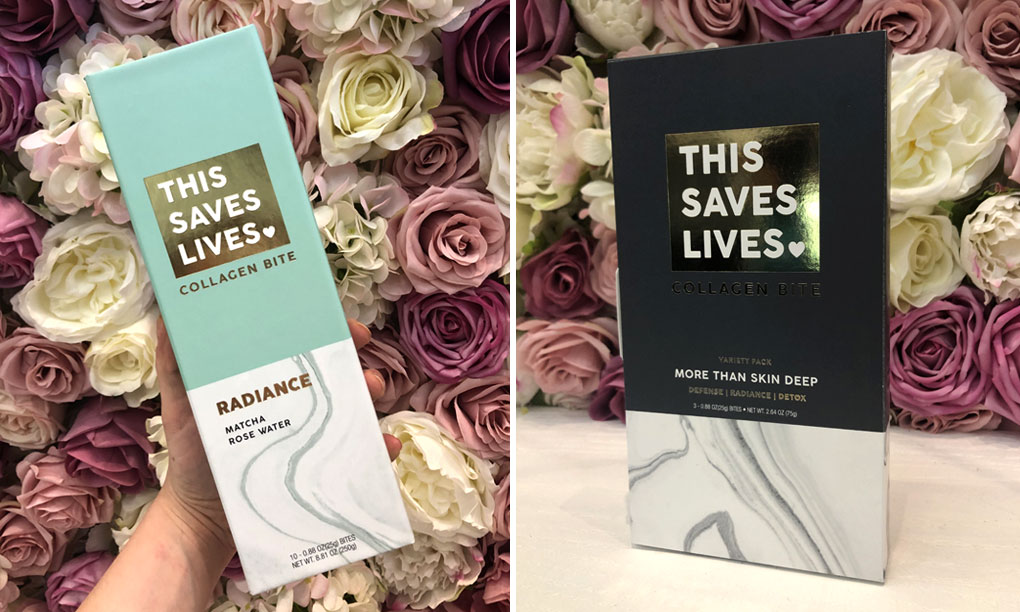
This Saves Lives
Formerly known as This Bar Saves Lives, the snack brand launched its new name at Expo West --- a change the company said was necessary as it expands into functional foods and bites.
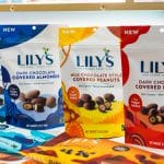
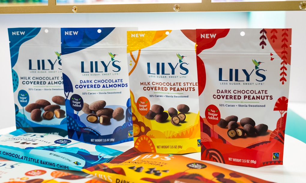
Lily's
Low sugar chocolate brand Lily’s has succeeded in the natural channel, but as it seeks to expand into conventional retailers and move into new categories, new CEO Jane Miller wanted a brand identity that would be both versatile as well as more eye catching.
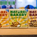
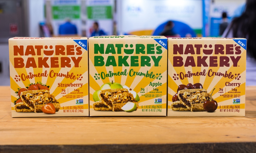
Nature's Bakery
At Expo West, Nature’s Bakery unveiled a new brand identity and “modern” packaging designed to better showcase the snack brand’s commitment to quality and taste. The new look features bolder colors and new imagery “designed to highlight the vibrancy and wholesomeness that is at the heart of [the brand].”
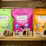
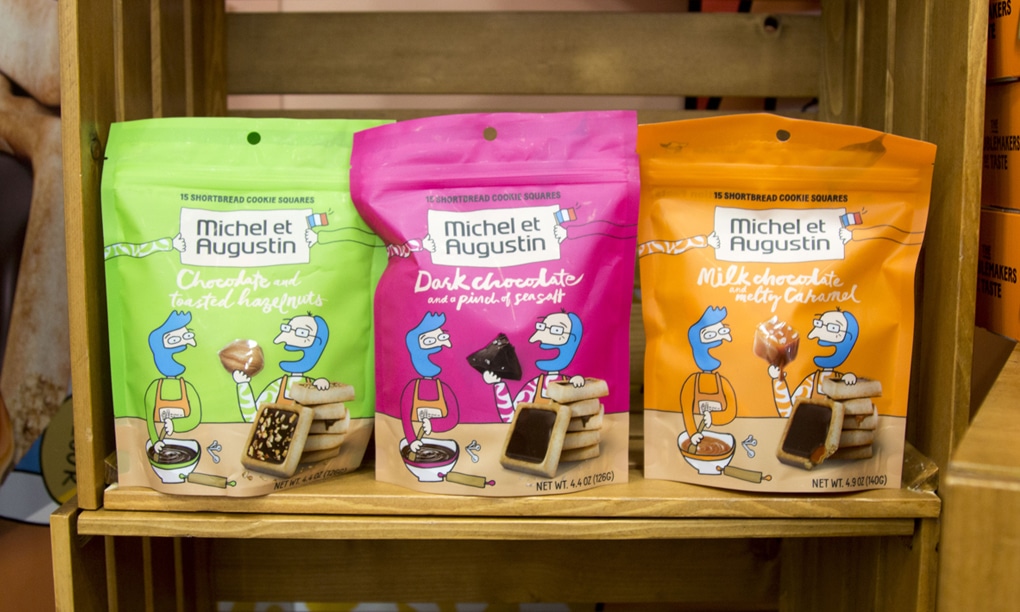
Michel et Augustin
French bakery brand Michel et Augustin’s redesigned packaging still features kooky, bold graphics, but adds newly redrawn, more prominently featured caricatures of its founders -- complete with blue hair.
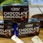
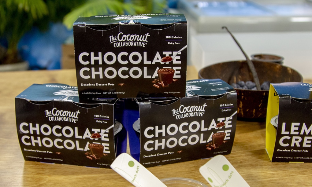
The Coconut Collaborative
As British brand The Coconut Collaborative expands into the U.S. market, the company has tweaked the packaging for its plant-based yogurts and desserts to highlight its array of high quality ingredients.
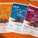
Three Jerks
The premium grass-fed beef jerky brand has a new lower-priced line that scraps the craft paper packaging of its filet mignon jerky for a more traditional plastic film. Each SKU is clearly indicated by a color band across the top of the bag.
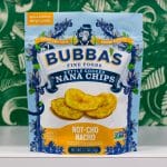
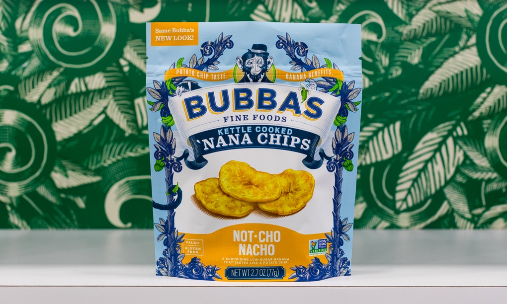
Bubba's Fine Foods
Paleo snack brand Bubba’s Fine Foods debuted a new look at Expo West that the company hopes will highlight its bold flavors. The packaging also features new product shots and close-ups of the brand’s signature ingredient, Saba bananas.
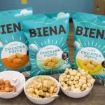
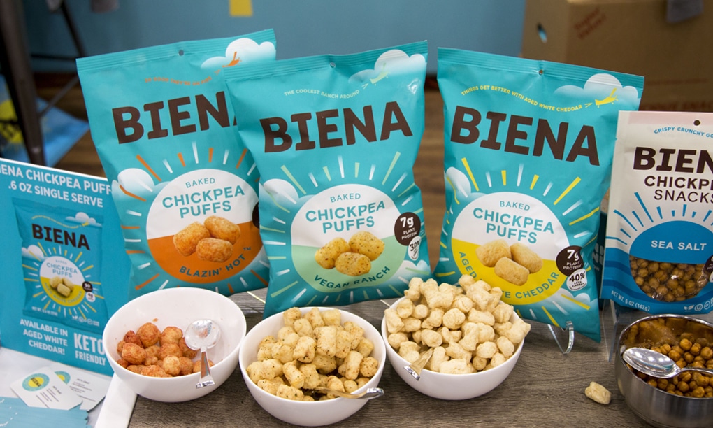
Biena Foods
After launching a line of puffs, snack brand Biena Foods decided it needed to create an “extendable brand identity platform.” The new design keeps the signature colors but adds a sun to the center of each bag, along with a new font treatment.


