
Packaging Makeovers at the Summer Fancy Food Show

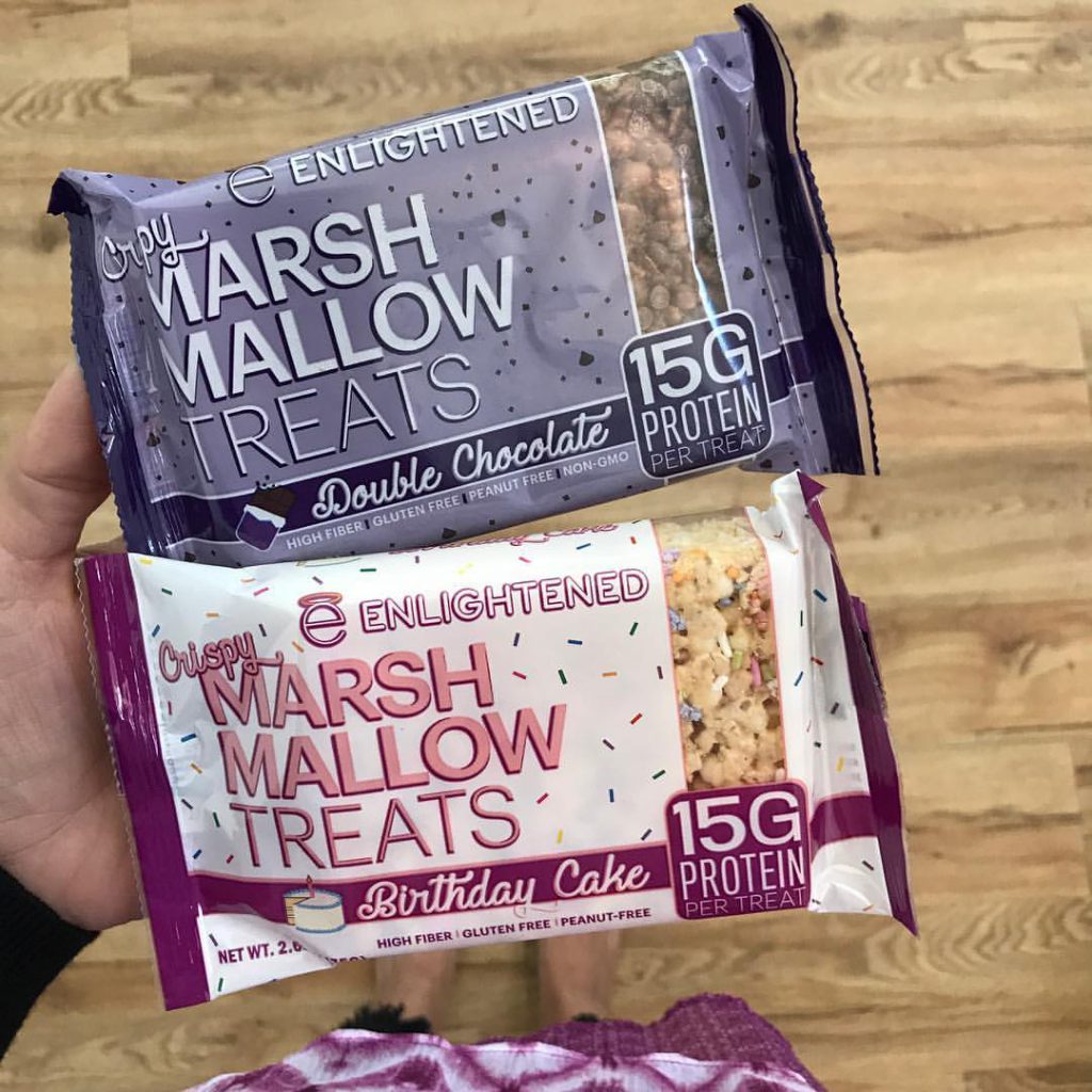
Before: Enlightened
Enlightened originally launched its marshmallow treats under the same brand as its low calorie ice cream line.
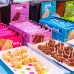
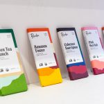
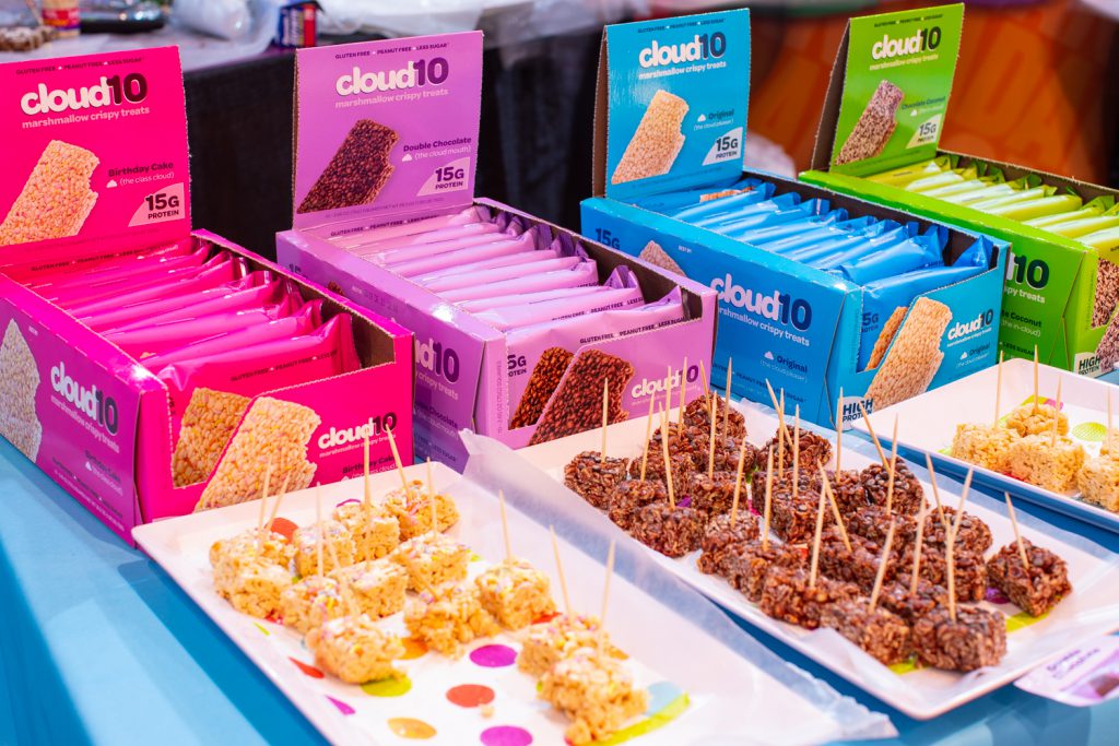
After: cloud10
The treats have been rebranded and now incorporate a brighter, more whimsical look for the adult versions of this childhood treat.
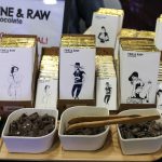
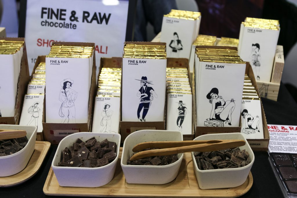
Before: Fine and Raw
The gourmet chocolate company has always embraced hand-drawn art on its packaging.
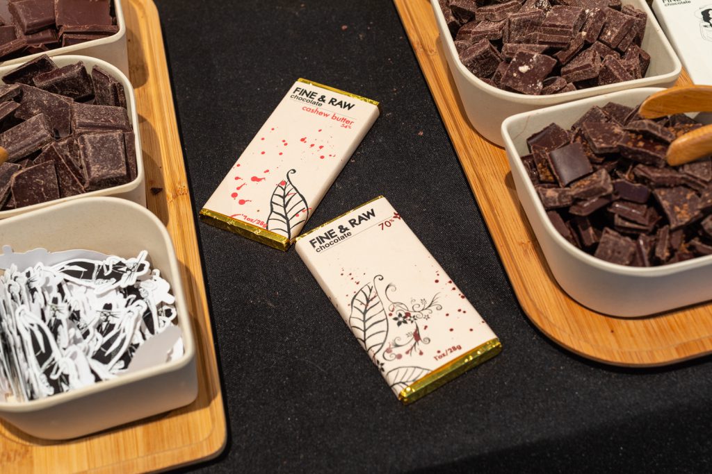
After: Fine and Raw
Now, the design still uses that artistic style, but with splashes of color and flowers.
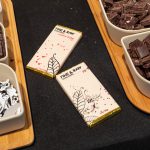
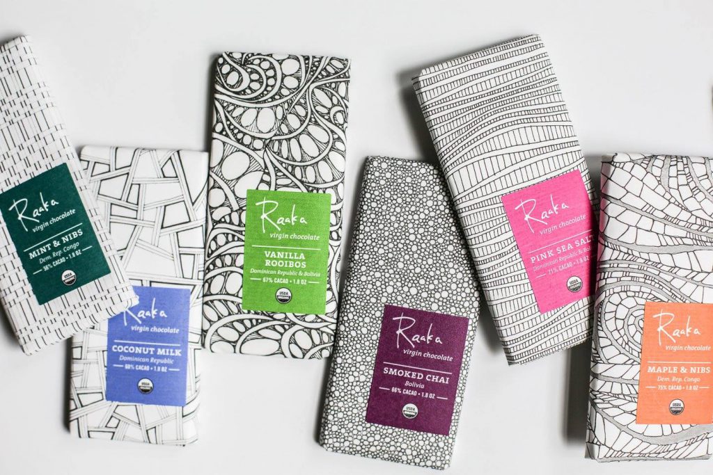
Before: Raaka
Raaka chocolate has always tried to highlight the art of making chocolate.
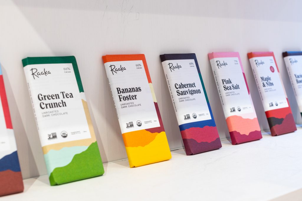
After: Raaka
Now the line embraces abstract, watercolor-like designs in bold colors in a true artistic expression.
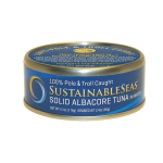
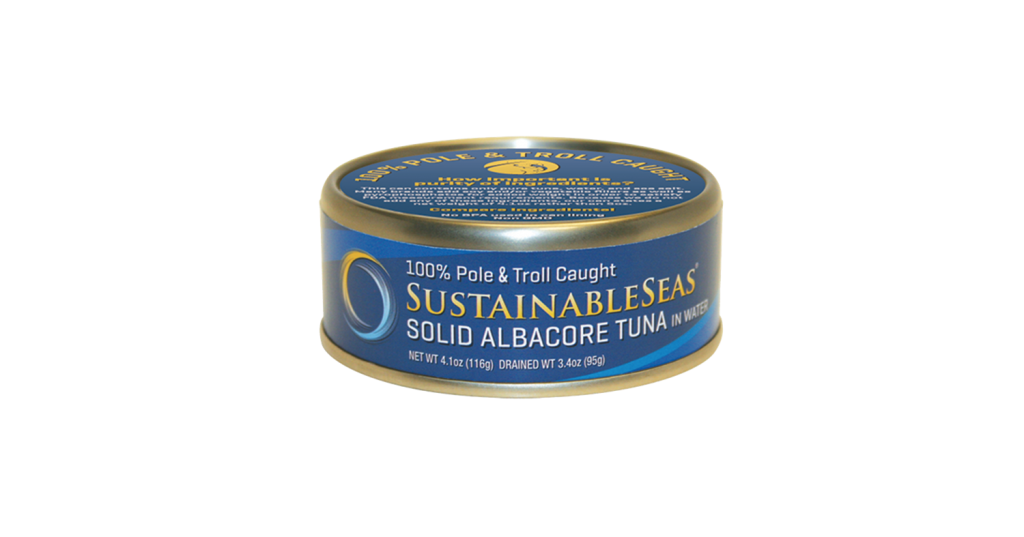
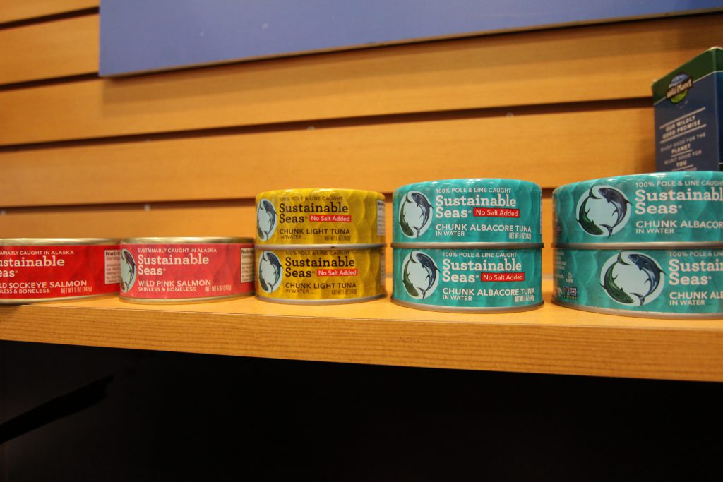
Before: Sustainable Seas
Sustainable Seas is Wild Planet's lower-priced, more accessible seafood line.
After: Sustainable Seas
The new packaging uses bold, bright colors to make the line more memorable to consumers.
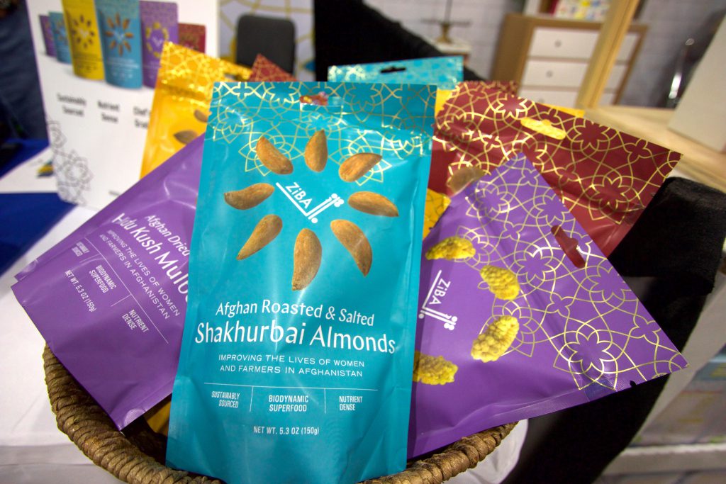
Before: Ziba
This Afghanistan-based ingredient company originally was a supplier providing wholesale ingredients to U.S. companies.
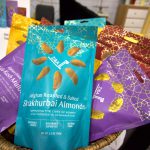
After: Ziba
With the new look, the company is positioning itself as a brand and using its packaging to tell the story of its Afghanistan supply chain.
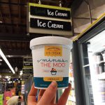
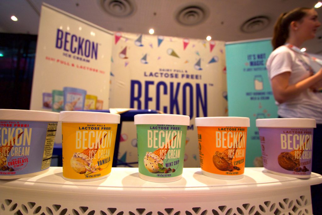
Before: Minus the Moo
The lactose-free ice cream brand previously confused consumers who weren't sure if it was dairy-based product.
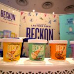
After: Beckon
The goal of the rebrand is to "beckon" consumers back to dairy with their lactose-free alternative to ice cream.
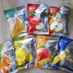
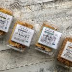
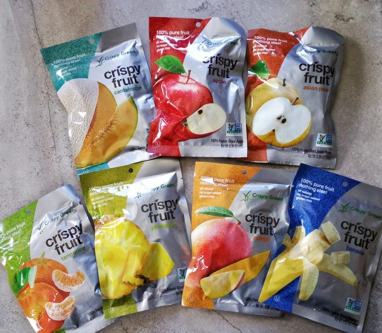
Before: Crispy Green
The old look was more functional and downplayed the brand's name in favor of highlighting ingredients.
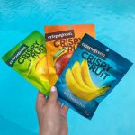
After: Crispy Green
The new packaging better calls out what the product is and uses brighter, metallic-finished shades for a cleaner and more modern look.
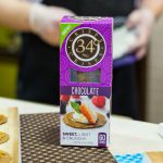
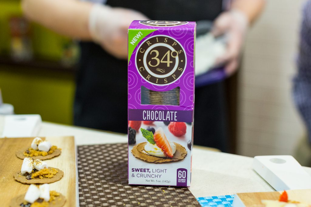
Before: 34 Degrees
The sweet crisp line was originally launched in the same box format as the brand's savory, specialty cracker collection.
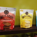
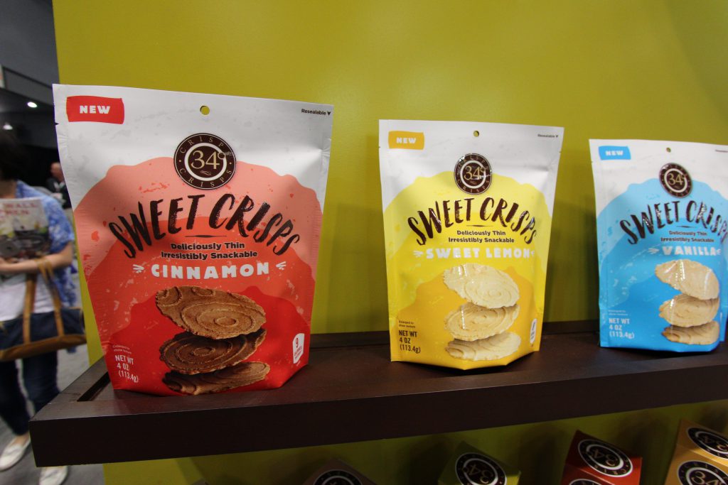
After: 34 Degrees
With the new resealable bag, 34 Degrees hopes the new line promotes snacking for millennial consumers.

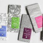
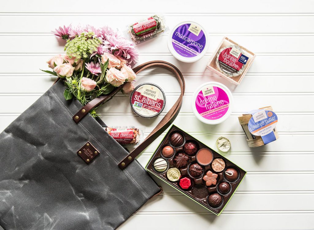
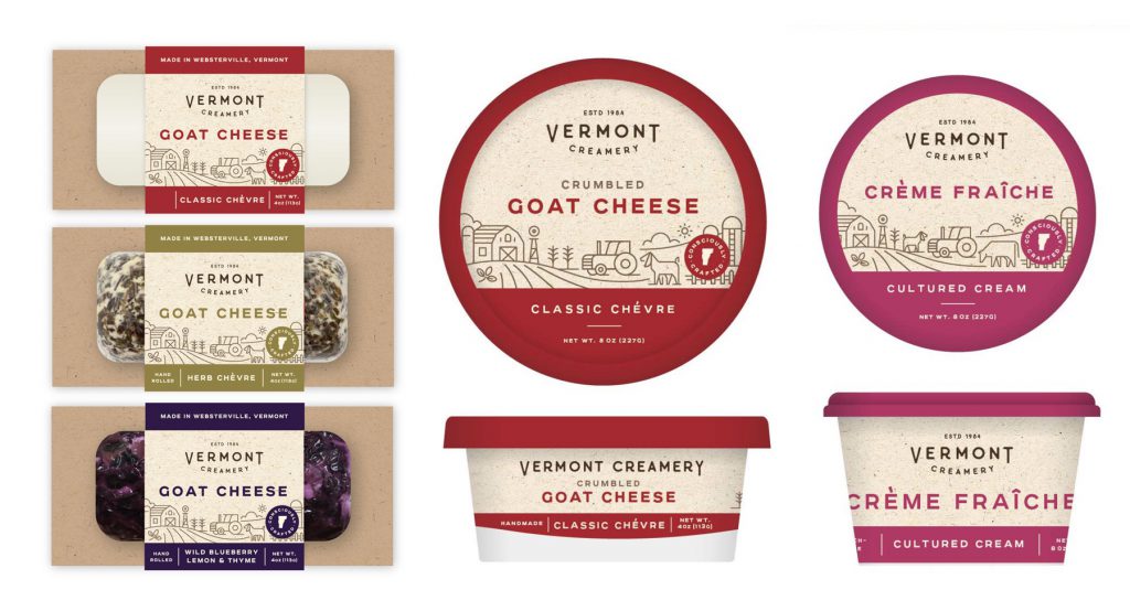
Before: Vermont Creamery
Vermont Creamery's packaging was previously focused on conveying to the consumer what lay within.
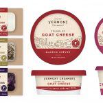
After: Vermont Creamery
The products now have a more artisanal, premium feel with new branding that features hand drawn images.
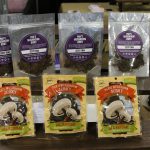
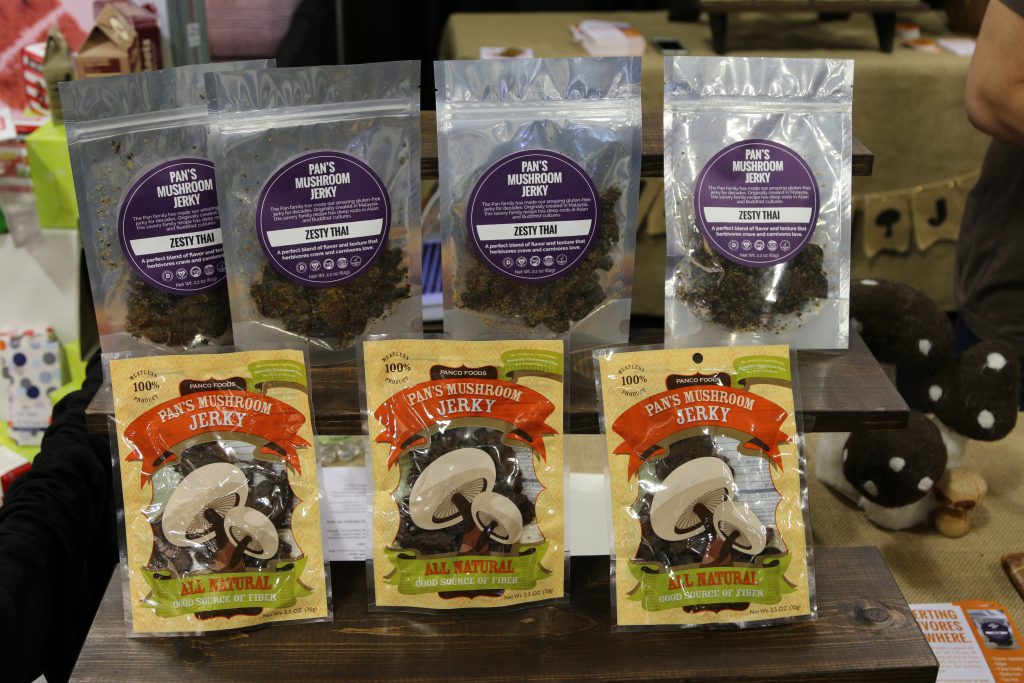
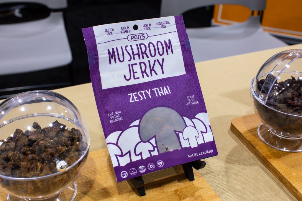
Before: Pans
Pans mushroom jerky's first packaging iteration was filled with illustrated forest drawings.
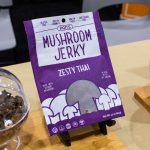
After: Pans
The brand's matte bag now highlights the key ingredient in callout and imagery.
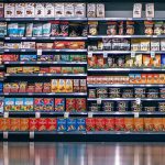
The Summer Fancy Food Show is known for its abundance of premium packaged baked goods and gourmet cheese, but last month’s expo was filled with reinvigorated product packaging, as well.
During the specialty food show, food brands across categories debuted rebrands and redesigns that cater to shoppers’ desires for transparency and clean ingredient lists. Many opted for simpler looks, less text and brighter colors to catch consumers’ eyes on shelves.
From a Brooklyn-based chocolate brand’s abstract and artful new packaging to a complete rebrand for the maker of a crispy cereal treat, here are some of the new looks the NOSH team saw from the floor.


